In the world of paint, the word sheen is used interchangeably with gloss. Both terms refer to the amount of light reflected or scattered from the surface. Some common terms for the level of sheen include flat, matte, eggshell, satin, silk, semi-gloss, and high gloss. These terms are not standard and different paint manufactures may not use the same terms for their paint finishes. For the purpose of this discussion, we’ve separated the sheens into 3 groups.
The first group is the flat or as some manufactures call the finish a matte finish. Flat paints are a valuable design tool when use correctly. Because they are the most non-reflective, flat paints tend to conceal imperfections and flaws of the wall surface. In a visual sense these paints tend to smooth a rough or blemished wall surface.
The second group is the satin or eggshell finishes. These finishes reflect a little more light than the flat paints, but not as much as the semi-gloss or high gloss finish. These paints have a little more warmth and give the appearance of more depth. In contrast to the flat finish, the satin or eggshell finish will show more of the imperfections of the wall surface. From a maintenance perspective they are more resistant to stains and are easier to clean.
The last grouping is the semi-gloss or gloss finishes. These finishes reflect the most light, draw the eye, and create depth. They are commonly used on an accent wall and on interior doors, trim around ornate glasswork, and door or window trim. These high gloss paints can be used to brighten dark spaces. Under most common lighting conditions, a combination of a semi-gloss sheen and a light colored paint is an optimal technique to brighten dark spaces. Because these high gloss finishes reflect the most light you should avoid using these paints in areas of excessive glare. Also keep in mind that the gloss finishes will highlight the wall’s imperfections.
Choosing a color palette for your interior walls can be that easy. Color therapy solutions can sometimes be easier than you think. Discover 10 tips to help you explore your color preferences and say bye to your white walls.
Start with the Formal Areas of the House. The living room, dining room and entry way will usually be the formal areas of your house. Choose a color scheme for those main living areas first. Then start pulling one color from the scheme into the other rooms. For example: take the green sofa and tone it down (say, to sea foam green) for an accent in other areas of the house like the den, bedroom or office.
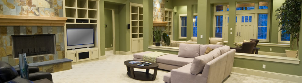
Let the Room Live. Living rooms are where the stories of our lives are lived. The easiest way to revise those stories is with color. Bringing updated color into your decor is all about adding that unexpected “wow” with an accent wall or cushions, rugs and other accessories.
Go with the Architecture. If a small room needs color in your house, don’t paint it stark white to make it seem bigger. Instead, make it cozy and welcoming to its architecture with a deep rich, warm color scheme. Let your big rooms expand with light, and your small rooms wrap you up and nurture you.
Select a Color Scheme from the Largest Pattern in the Design. If you have patterned upholstery, an Oriental rug or large piece of artwork, select the colors you like from the pattern. To select a neutral wall paint color, look for the pattern’s whites and beiges.
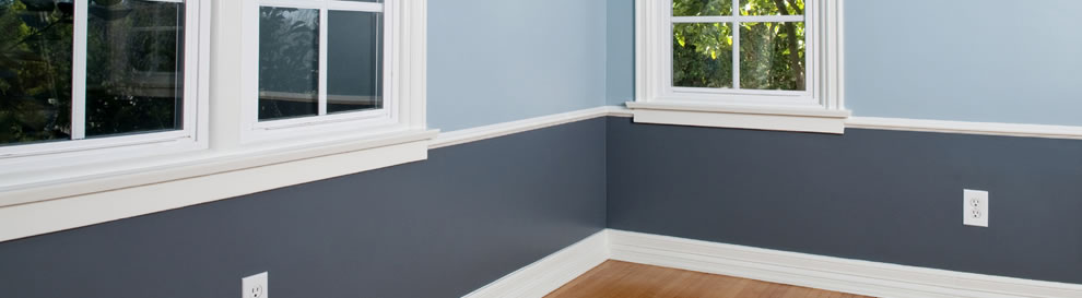
Decorate your Space from Dark to Light, Vertically. A unique way to make any space look good without much risk is to use darker color values for the floor, medium color values for the walls and light values for the ceiling. This is a safe solution for any room, but select a color palette that works going dark to a lighter ceiling.
Add Some Bling. A little glamour goes a long way in a room and can bring unique color. A crystal chandelier over the dining room table or an ornate gilded mirror over the fireplace mantel can transform a room with silver, gold or metallic accents.
Use the Color Wheel. In most cases, similar color schemes — like colors next to each other on the color wheel, such as blue and green — are more casual and relaxing, and work best in home spaces. This is a good strategy for a bedroom, where you want to rest and recover.
Study the Colors your Wear. We all buy clothes in colors we like to wear and think we look good in. Likewise, you should decorate your rooms in colors you look good in. If you don’t wear yellow, don’t get a yellow sofa. If you don’t like to wear drastic colors, don’t use drastic colors in your home. You’re going to get sick of it. Whatever color scheme you choose, McCauley advises to put something black in every room. “The black clarifies all the rest of the colors in the room,” he says. Try a black lampshade, a black vase or a black picture frame.
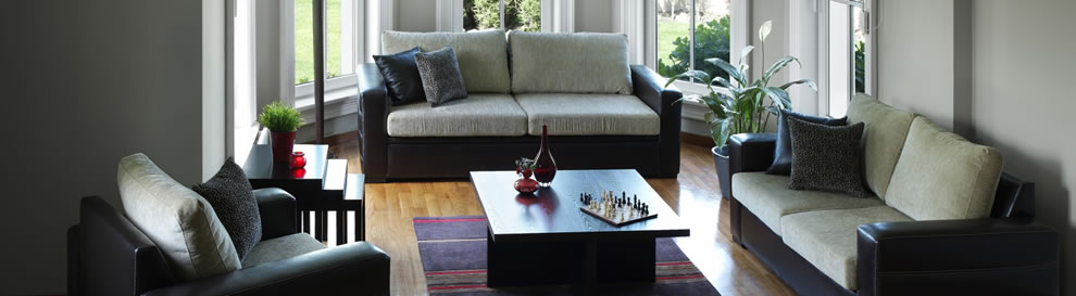
A Basic Rule. Divide the colors in your space into components. 60% of a dominant color, 30% secondary color and 10% used for accent color. Walls are Majority, upholstery would represent secondary and the room accent would make up the rest. The colors are properly balanced and there is a shot of color (the 10 percent color) for interest.
Follow your personal style. If you decorate honestly, other people will appreciate it because it’s you, even if they’d never decorate their own house in the same way. That means if you want to make every room in your house red, white and blue, go for it. You can make any color look good as long as it’s your taste.
Introduce new life into your living room or family room with these gorgeous color trends.
Bringing updated color into your decor is all about adding that unexpected “sizzle” or “wow” moment with an accent wall or cushions, and other accessories. Inject new color into your living room to help tell those stories about your life.
Trends in color now include:
Contemporary elements such as textured wallpaper with metal threading instead of shimmery paint.
Add a little glamour like a crystal chandelier in the dining room table or an ornate painting over the fireplace mantel can transform a room. The colors are muted and more restrained.
Look for things that add a bit of glamour and contemporary elegance to a space, and also reflect the colors to open up the room.
If you have artwork on the walls, white is a great background color. White doesn’t overpower what you’re trying to showcase with your artwork.
New shades of Neutrals are great for soul-satisfying earthy tones are great to relax in, and enjoy the company of friends and family. They aren’t the old standard beige.
Choose furniture and upholstery that are neutral, then get bolder with the colors of the walls, accessories and fixtures in the room.
Warm reds are a great accent color for living rooms because it’s warm and cozy, and makes people want to stay in a room longer. It’s also energizing, so it encourages people to talk.
Have some unadulterated fun in at least one area of living space. Add color to set the tone or create a dramatic look for a special space.
First, know that if you are in the mood for bold colors, the timing is right. They are absolutely in fashion. Gather some color courage, be bold and know that with risk often come great rewards. Let confident Red, gorgeous Purple, intriguing Blue or happy Yellow help you define a place where you feel at home.
Instinct – The soul of Instinct is warm and authentic. It fuses the ancient, mythological, raw, and the primitive with a highly technical modern-day aesthetic. Instinct belongs to a citizen of the world with grown-up tastes and could be simply described as a mix of ethnic exoticism and modern sophistication.
Glamour – The mood is glamorous and mysterious. Glistening metallics and intricate motifs invite to a sophisticated decor. With a contemporary perspective, it lets us bring to life a new gold standard connecting the past with the present.
New Bohemia – A whimsical sense of design, and a rebirth of craft. New Bohemia is a pastoral trend that blends bucolic elements with second-hand objects for an authentic look that updates the vintage aesthetic for a contemporary age. The composition of floral inspiration, mix of modern and craft with a feminine touch transforms the place in an original but authentic home.
Simplicity – Is about living simply… It offers an honest yet elegant way of life. It is a philosophy steeped in the human desire for clarity, function and craftsmanship that refuses waste and love to reclaim the beauty of things past.
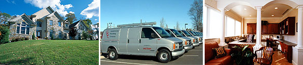
Our company was formed in 1975 in Coopersburg, Pennsylvania. Over the years we have installed, sold, and recommended many products for our clients’ homes and commercial buildings. These products need to last and work with minimum maintenance.
Our choice of brand products have assured our clients the best results in all the work we perform for them. Using a top brand may be a little more expensive, however it will work in the end.


 Our company was formed in 1975 in Coopersburg, Pennsylvania. Over the years we have installed, sold, and recommended many products for our clients’ homes and commercial buildings. These products need to last and work with minimum maintenance.